Dropbox Revamps Web Interface With Files And Team Activity All In One Place
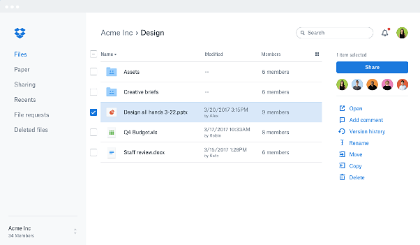
Dropbox has rolled out their out their new redesigned website which they say is designed to bring your files to life with team-first functionality, becoming more than just a place to store and access your files, but for people and conversations, too.
There’s also simpler navigation making it easier to share files and paper docs with others, leave feedback, and see whats changed without need for back-and-forth over email. They’ve also customized the toolbar, presenting only the relevant next steps for what youve selected.
The new dropbox.com lets you browse files visually with a thumbnail view, and see who else is collaborating with you on shared files and folders. And they’ve made search smarter, providing results across your files and Dropbox Paper docs.
Dropbox says their new website is designed to help you focus on the task at hand. With clearer account separation, its easier to switch between your work and personal Dropbox accounts. And when you do, now youll only see search and notifications for the account youre in.
To see the new web experience for yourself and take a quick tour, log in to your Dropbox account on the web.
For more information, visit:
https://blogs.dropbox.com/dropbox/2017/04/the-new-dropbox-website/
Source: Dropbox

