Google Search App For iOS Gets A Major Makeover – ‘Book Mystique Review
Google has given iOS users an early Christmas present with a substantial update of it’s not-very-often-upgraded Google Search app. Google Search has been my go-to tool for Web searches since it was rolled out about three years ago. It’s a quicker, slicker alternative to full Web browser, especially when you just want to find something in a hurry and have no interest in leaving a tab open for future reference. For me, it’s one of the great things about using the iOS, but it seems to be a bit of a sleeper in that it doesn’t get a whole lot of attention, which is a pity.
Interestingly, in my experience the full Google Chrome browser for IOS has been a disappointment, which I attribute to Apple forcing makers of iOS browser alternatives to its Safari use the Apple WebKit rendering engine instead of their own, and Chrome, which is probably my most-heavily used browser in OS X, seems to have emerged from the transformation suffering from an elegance deficit. On the other hand, Google Search, which was engineered as an iOS app from the proverbial ground up, has conversely been well-sorted-out and a solid performer from the get-go. It’s simply outstanding — a lovely piece of work. It has obviously been carefully tailored and optimized for the iOS, and works with the same speediness, fluidity and smoothness we’ve come to expect from the Chrome browser for OS X
Relatively speaking, the iOS version of Safari holds up a lot better in comparison with other Web browsers that support the iOS, like Opera Mini, Dolphin, Diigo, Maxthon Puffin, and more. Actually, I would rate Safari at or near the top of the iOS pack along with Diigo, and Maxthon, both of which I find more tractable than Chrome for iOS. While I prefer Opera to Safari in their respective OS X permutations, Opera Mini on the iPad has been a disappointment, with a clunky user interface and distinctly less lively performance than iOS Safari. These are all pretty good Web browsers, but I and the others aforementioned. I do miss cool Chrome features like the slick and seamless Google Translation for non-English language Websites.
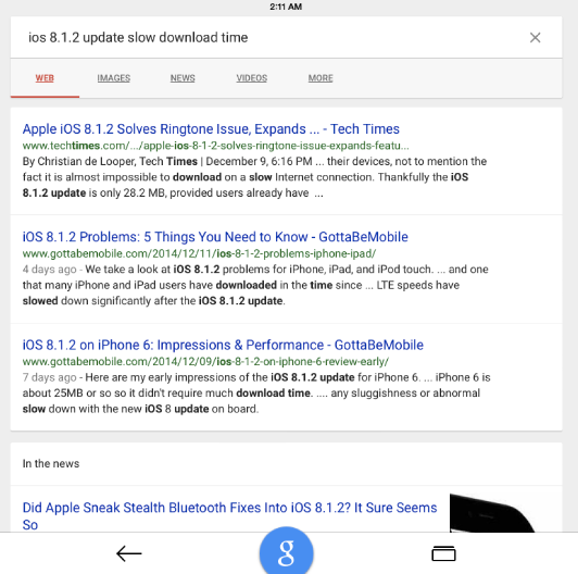
The new Google Search features a complete user interface makeover, conforming with the Material Design appearance theme recently introduced in Google Android apps. I can’t say I think it’s an aesthetic improvement, but it arguably makes the app more functional, albeit somewhat busier, especially with Google Now (see below) enabled.
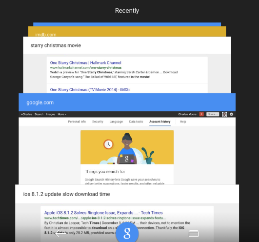
New is a blue Google button at the bottom center of the window, with a back arrow that will bring you back to the Google iOS main view situated to its left. Google Search for iOS supports Voice Search, allowing users to search by voice without typing, and there is no longer any ambiguity about how to quickly return to the mic (or search box if like me you prefer the precision of typing commands) when you need to ask your next question. The Google button will bring up the new search page with one tap. In the main view there’s a new “Recents” button in the upper right corner of the app window that summons your most recently viewed pages arranged in virtual card stacks (a tip of the hat to Apple’s late, lamented HyperCard Mac OS app that pioneered the card stack metaphor back in the ’80) you can flip through using a finger gesture and bring to the fore again.
Looks-wise I preferred the clean and uncluttered interface of previous versions, and I’m finding it’s demanding some adjustment, especially of muscle memory for things that have been moved, I’ll get accustomed to it, although I’m especially puzzled as to why they made the entire address/menu field at the top of the window into a thicker than necessary page load progress bar — particularly noticeable for those of us who prefer and default to landscape mode, where vertical headroom is already at a premium. Seems a gratuitous waste of precious screen real estate.
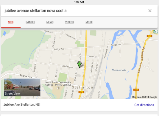
Also new, you can return to recently visited pages or start a new search with a single tap, and find locations. On an iPhone you can search Google Maps, and/or explore interactive maps, or explore Street View without leaving the Google Search app.
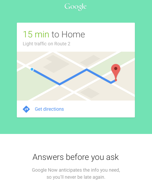
The new Google Now service is always running in the background, and Google displays Google Now cards when you’re most likely to need them. When you affirm “Yes, I’m in”, Now will be turned on as well as the Location History setting for your Google Account. Your private Location History creates a map of where you go with your logged-in devices (including when you’re not interacting with a specific Google product). This map is accessible only by you, and allows Google to provide information like automatic commuting predictions, improved search results, and more precisely targeted ads on and off Google. Now also uses data from other sources, such as your data logged by Google products or in third-party products that you allow Now to access.
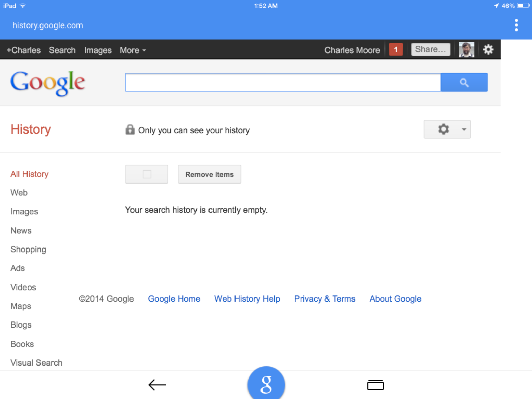
For example, if you have a synced calendar entry for a dentist appointment, Now can check traffic and suggest when you need to head out. If your dentist is in your contacts, Now can label the destination accordingly. And if you have searches stored in your Web History, Now can show data like sports scores, flight status, stock quotes, relevant news stories, and so forth. Data is used by Now under Google’s Privacy Policy, and you can manage Now settings anytime by going to the Google app’s settings.
.
The updated Google app for iOS is available now as a free download from the iTunes App Store.
For more information, visit:
http://bit.ly/1vXXIOc
App Store:
https://itunes.apple.com/us/app/google/id284815942?mt=8

